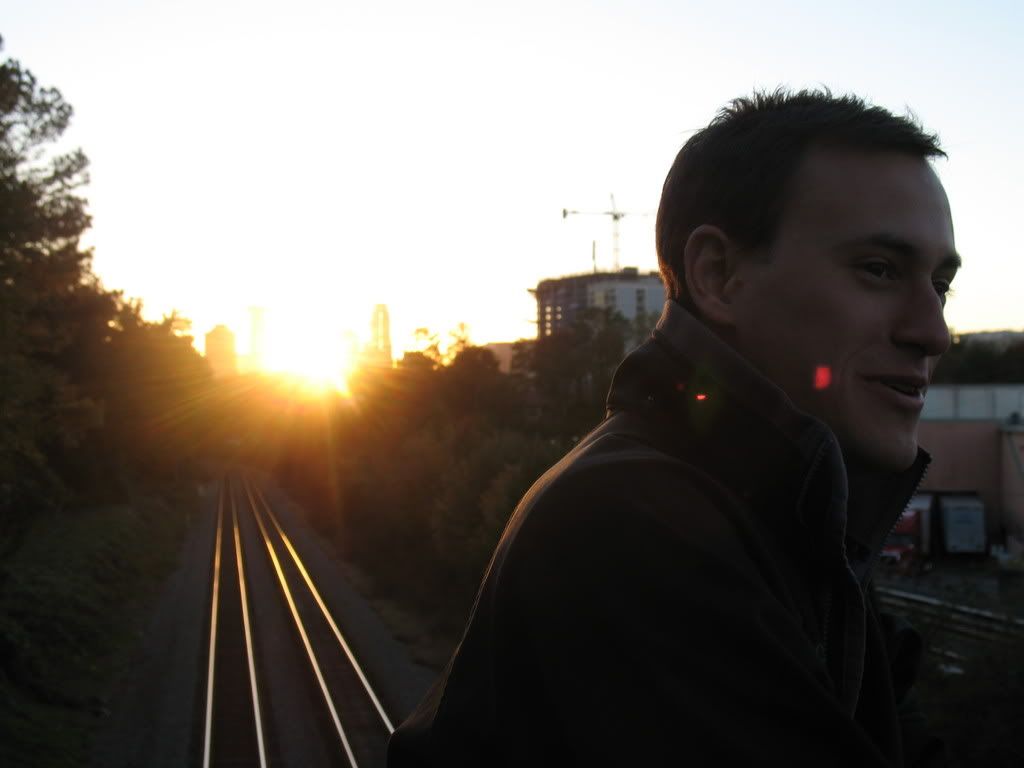
photos pretty great, i would possibly change the font. though, more importantly like the others said, a different color or value would benefit the image. the font-color now stands as the darkest value in the entire photo, and feels strange because it is close in value to the values in the photo so it doesn't contrast with it nor complements it.
also, the kerning could use adjusting. it doesn't relate to the composition, unconsidered, generically spaced.

4 comments:
I think it looks good. I would think about changing the color of the text to something other than black though.
The text color's been giving me some problems. Something blue might work, or maybe blue with a light black dropshadow.
It's been way to long since I've had to think of design stuff.
Thumbs up. I really like the photo.
photos pretty great, i would possibly change the font. though, more importantly like the others said, a different color or value would benefit the image.
the font-color now stands as the darkest value in the entire photo, and feels strange because it is close in value to the values in the photo so it doesn't contrast with it nor complements it.
also, the kerning could use adjusting. it doesn't relate to the composition, unconsidered, generically spaced.
hope thats not tmi.
Post a Comment