A quick preface:
I don't believe the quality of a show is determined by how closely it matches a theme or artist's statement. In an ideal world, themes and statements provide the viewer with a glimpse of the artists' processes and goals. But I think it's fairly unrealistic (especially with small gallery shows) to expect a statement or "theme" created weeks or months after some works in a collection have been created to come close to accurately matching a good sized span of an artist's work.
(I'd really like to hear input on this idea from curator/artist types)
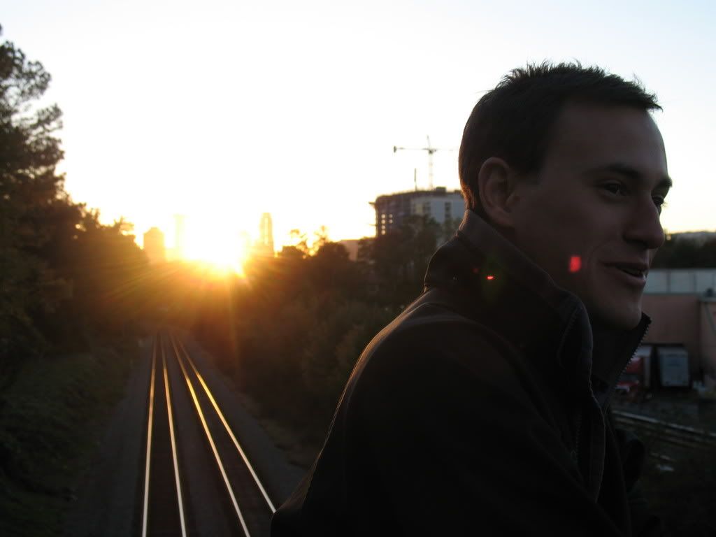
This photo (and all others used in this post) courtesy of Thoughtmarker's Mike Germon.
With that preface in mind, take a look at a few of these shots: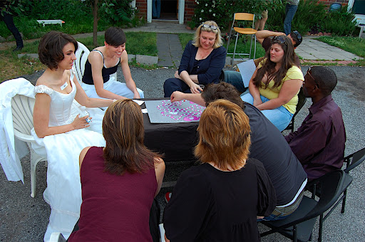
McCalla Hill demonstrates the "Till Death Do Us Part" board game, which continued to draw a good sized crowd throughout the evening.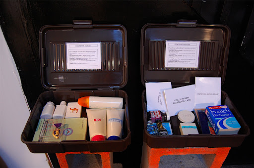
Scott Raffield's "Army and Artist Survival Kits." Probably one of the most "gimmicky" pieces in a show full of gimmick pieces. Still, I couldn't help pawing through the suitcases' contents, so Raffield must have been doing something right.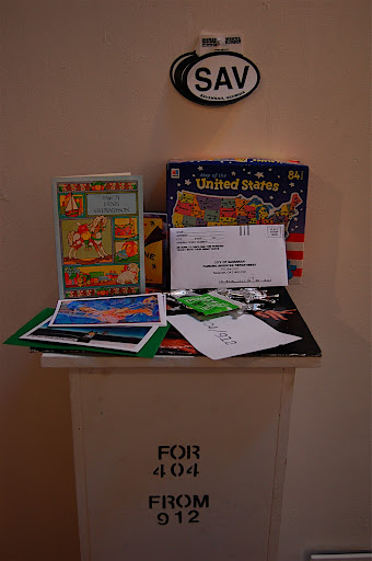
I believe this one was put together by all the Savannah SCAD students. A "for 404 from 912" pedestal stood nearby.
Almost all the show's pieces were in some way touchable or interactive. In more extreme cases, pieces could easily be "destroyed" by their observers; one artist drew a map of the United States onto a whiteboard - markers and erasers hung at hand level just below the board. McCalla Hill invited us to mail wedding invitations to friends and strangers. Another artist displayed letters mailed to strangers, and the pictures and replies those strangers sent back.
Was this prevalence of interactive art a reference to the crossing of boundaries suggested by "404/912"?
Maybe. I'm more inclined to ascribe that prevalence to a specific stage in the SCAD student's artistic development. Dipping a bit into pop psychology, I wondered if the students' desire to make interactive art might be traced to their desire to create a dialog with a world which has only become changeable in the last few years of their lives. As artists mature, they seem to apply more finesse to the idea of creating dialog, and require less overt proof that their work is impacting the wider world.
That's my pet theory anyway.
Overall, a good show. Not perfect, not great, but a good snapshot of a group of artists at the cusp of their careers. Definitely the best show I've seen at MINT so far.
Thursday, May 29, 2008
404/912 @ MINT Gallery, 5/24/08
More on Richard McMahan's Mini Museum
Original films by Kendall Messick.
Original film by Raymond Jackson
I love seeing things like this!
Three quick notes:
1) I'll be posting a few million more posts before the week's up. Check back often. Send money.
2) Ruth Laxson's new show at Marcia Wood is pretty awesome. This is one we really need Jerry Cullum to review.
3) I'll be writing a few music reviews for Have You Heard each week. My first review was posted today. (One difference between visual art and music - almost every piece of art you see will be "good," or, at worst, indifferent. In music, most of what you hear will be bad, and will be experienced by an audience several times larger than is available to most artists.)
Monday, May 26, 2008
Tenmyouya Hisashi
(I couldn't upload these pictures without compression problems - open them in a new window for more detailed views)
Eight "Serpent and Crane" Moves vs. "Drunken Fists"
RX-78-2 Kabuki-mono
Nine Kamakura Samurai
Pandora's Box
More pictures.
Thursday, May 22, 2008
One of Those Moods

Brian Hitselberger, Come On
Hitselberger's website, with more pictures and a recommended reading list.
-
I just started reading John Berger's Ways of Seeing and the first volume of Clement Greenberg's Collected Essays and Criticism. Ways of Seeing was published in 1973; it's based on a BBC TV series and contains 7 essays, 3 of which are composed entirely of pictures. Greenberg's essays were written between 1939 and 1944; in a 1939 essay on avant-garde and kitsch, he writes:
Kitsch, using for raw material the debased and academicized simulacra of genuine culture, welcomes and cultivates this insensibility. It is the source of its profits. Kitsch is mechanical and operates by formulas. Kitsch is vicarious experience and faked sensations. Kitsch changes according to style, but remains always the same. Kitsch is the epitome of all that is spurious in the life of our times. Kitsch pretends to demand nothing of its customers except their money - not even their time.
I'm going to put the two books together in my nightstand before I go to sleep and see which comes out alive tomorrow morning.
Tuesday, May 20, 2008
Oliver Smith - Absence of Need
The show's full title is Absence of Need: Images of Urban Abandon, and it runs through June 14 at Eyedrum.
I had forgotten about this exhibit until a few moments ago, when I unearthed Smith's artist statement from beneath a pile of dirty clothes, business card confetti, empty matchbooks, and other assorted bachelor detritus. I hadn't actually planned to write about the show (and I'm still not going to write much), but I was struck by a few phrases from Smith's statement:
"One strip shopping center was knocked down and cleared out before it could be rephotographed. In a few days everything was gone. Without the original photographs it was hard to remember how things looked. Architectural amnesia. Transformation of place and loss of the familiar created an involuntary displacement. I expected something to be there and it wasn't. Desire for a continuance of memory was swiftly negated. It didn't matter. A new memory/place connection would eventually form over the old one."
That phrase, "I expected something to be there and it wasn't" captures so much about my experience growing up in Atlanta - I feel as if the city as a whole is constantly moving towards some new stage, but consistently falling short of the dreamt-of "New Atlanta"/"New South." Perhaps some of that feeling is based on going to a high school named after Henry W. Grady, the Athens-born journalist who coined the phrase "New South" in an 1886 speech:
"The New South is enamored of her new work. Her soul is stirred with the breath of a new life. The light of a grander day is falling fair on her face. She is thrilling with the consciousness of growing power and prosperity. As she stands upright, full-statured and equal among the people of the earth, breathing the keen air and looking out upon the expanding horizon..."
Can a show be called "good" because of the thoughts and memories it inspires, even if the art itself lacks that thrill and tense fingered feeling that great art inevitably provokes?

I can't really recommend the show to you - unlike a lot of the other art I've written about here, I don't think there's much difference between seeing these photographs in person, and seeing them online. In both settings, the concept of the work is much more powerful than the work itself.
Perhaps Smith realized this, and understood the problem inherent in inviting people to view photographs which purposefully avoided artistry; he's also included field recordings taken at the abandoned strip malls he photographed. I wasn't able to listen to the recordings (a band was tuning up in the next room), but, with the recordings included as part of the viewing process, the whole exhibit could definitely be worth a quick look. And certainly worth a long evening's thought.

[top two images are from Eyedrum's website]
Saturday, May 17, 2008
Richard McMahan's MiniMuseum, at the College of Charleston's Addlestone Library
I'd like to note that I disagree categorically with the comments made by the anonymous commentators (actually a single person who has a personal problem with Richard McMahan) in this post. I've disabled future comments on this post as a way of keeping "Anonymous" from posting more drivel. Please, if you bother reading Anonymous's comments, keep in mind the basically unhinged nature of their personality, and don't let them influence your opinion of a fantastic artist.
***Images from the full collection*** Libraries don’t usually have art. When they do have art, it’s generally the sort of installation dreamed up by head librarians with too little free time, or student art groups with WAY too much free time.
So I was surprised at the amount of thought and effort which had gone into the College of Charleston library’s most recent exhibit, Richard McMahan’s MINImuseum. The exhibit showcases about 4000 painted and sculpted pieces, and was designed and set up in just under a month.
The college is justifiably proud of their display, which was planned by students from the architectural school, and fabricated using some apparently cutting edge* automated laser systems.
From the exhibit’s brochure:
“For the past eighteen years, Richard McMahan has been creating his own personal museum collection featuring miniature replicas of the world’s greatest works of art. This Florida savant has an exceptional talent for producing tiny images representing famous art in museum collections such as the Hermitage, the Prado, the Louvre, the Metropolitan, and the Museum of Modern Art, among others. Though he has never been to any of these museums in person, this self-taught artist has studied these works through books in his local library in Jacksonville.
McMahan began his collection by working from photographs he found in over one hundred years of National Geographic Magazines. Included in this worldwide tour are cave paintings, a rendition of an Egyptian tomb (complete in all of its parts), art nouveau furniture, sculpture, graphic arts, drawings, paintings, and a wry selection of contemporary art.”
As with any collection of miniatures, I’m reminded of the “Ripley’s Believe It Or Not” museums (coincidentally, the franchise is also based in Florida). The exhibit uses a few visual techniques popularized by that sort of museum, placing several pieces in recesses which force the spectator to move closer to that portion of the exhibit for a good look.

In the Egyptian art section, we contorted ourselves to peer through pvc pipes at McMahan’s recreations of tomb architecture and murals. I remembered the intricate images of Egyptian pyramid traps I’d grown up with in grade school, and wondered which of the pipes housed a very cruel joke.

Magnifying glasses were included, furthering the sensation of exploration.

The exhibit is ordered by period – trying to take in each period in a single photograph, I was reminded of Kathrynn Reffi’s Color Recordings (described in detail at Local Ephemera), an attempt to record and catalog the predominate colors throughout a 7 day span of the artist’s life.

Cringe.

The history of art, under a single rotunda. So much cheaper and faster than visiting all those museums.


McMahan's sculpture work (the "twigs" in the second image are carved pieces of wood) is wonderfully exact.


Of course, the whole exhibit leaves me pondering the question of art duplication. These are a few questions I would have liked to ask McMahan at his artist talk this Saturday:
What tools did you use for your painting?
Which pieces took you the longest?
Which periods?
When you recreate a work, how do you know when it's finished? Are you trying to copy the images, or the spirit?

*Pun!
Friday, May 16, 2008
Apologies
I apologize, but I'm going to have to reschedule that article I promised. Delays in all the most important parts of my life, surprise deadlines, etc.
I just saw the most amazing art exhibit.
And it was sponsored by a college!
Lots of pictures, will write more sometime this weekend (hopefully).
Wednesday, May 14, 2008
A Reading Recommendation, From the Holy City

Thor: Ages of Thunder #1 - written by Matt Fraction, art by Patrick Zircher.
(excerpt from an interview on Newsarama)
Newsarama: Matt, what’s Ages of Thunder about, and how does it tie into the Thor mythos?
Matt Fraction: It's a Thor graphic novel, told in parts, that plugs the pure Stan-and-Jack interpretation of Thor and the Asgardians into the Norse myth cycle. It sort of exists outside of any current incarnation of Thor – one of my favorite things about the Norse myths is that it's cyclical; that Ragnarok has survivors and the stories begin again.
So we're using that as a motivation to look at Thor and his pantheon throughout various different eras of Ragnanroks, with various different visual interpretations. Each time they're living through these insane and colossal stories that build on top of one another, each chapter presenting us with another way of seeing Asgard as it rages towards its inevitable destruction and rebirth.
Ultimately, these stories present to us with the reasons why Odin saw fit to curse Thor with the humanity of Donald Blake, and who he becomes because of it. That's the uniting thread that, no matter what apocalypse he's skyrocketing towards, Thor had this flaw, and this ultimate redemption because of it, told in giant, divine terms. It was danced around back in Thor#159, if you want to get all continuity-guy on it; Ages of Thunder is a kind of explicit play-by-play, where Thor's lack of humility triggers all of these wonderful, horrible things.

Newsarama: So how did this project come about, and what appealed to you about working on Thor?
Matt Fraction: Thor had long remained a kind of a mystery to me – I couldn't find a way into the book, as a writer. Which is just weak. As a reader, there were bits that I loved but there were far more aspects to his history as a comics character that alienated me. And-- this is mortifying and embarrassing and I'm sure they don't remember this, but I do – the first time I talked to Axel Alonso and Warren Simons about what kind of stuff I wanted to pitch at Marvel, I said that if they were looking for a Thor mini, I wasn't the guy. Just, y'know – superdicky, small-minded, all of it.
It was the fantasy aspect — real or perceived-- that I just couldn't connect with; that kept me outside of the real power of the stories and the character. Then I had my, ahh, revelation on the road to Damascus, and here we are. I've seen the light, repented, etc. Now I'm ready to smash things with hammers.
Newsarama: Yay, hammers! Now, what are some of the stories that this one-shot touches on?
Matt Fraction: The reconstruction of the Asgardian wall. Loki's kidnapping of Idun, or who we're assigning Idun's role, and what happened to her apples. Sif getting her hair cut off. Drunken hijinx in an iron forge.
You know. The classics.
Three quick notes:
1) I'm in Charleston, SC until Saturday - got any gallery/stuff to do recommendations?
2) I'm working on a long (for me) essay, loosely based around my thoughts on spectators and art. With the help of a few more cups of coffee, it should be posted to Proclaim It Lost by Friday afternoon.
3) The Fraction interview's a bit lame (especially if you aren't caught up on Thor's comic biography) but the comic itself is a fun introduction to the summer reading season.
Friday, May 9, 2008
Spruill Gallery, 5/8/08
(More by nightfall)

I didn't think Tristan Al-Haddad's sculptures were as cool as some of the other stuff at Spruill last night, but they did make for good shootin'.
Also, the wood floor was covered with this thin white cloth, so walking through that corridor felt like stepping on gritty ice, which added a nice bit of contrast to the rest of Spruill Gallery's very stable old Southern charm.
Tuesday, May 6, 2008
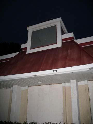
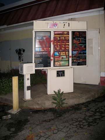
Atlantic Station
Pictures taken around 3pm today, as an illustration of the dangers of prolonged unemployment.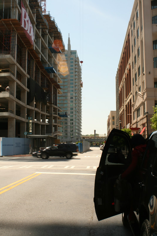
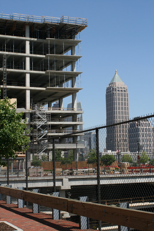
I used to hate it. Now I sort of love (but also hate) it.
Friday, May 2, 2008
Even More On Sopo's Frame Show, Canvases, and Space
(Updated, see below)
I haven't talked to anyone involved with the recent bicycle frame show at Radial Cafe.
I have built up a pretty good concept for the show in my head: painted metal bicycle frames, but painted upon as if they were flat canvases wrapped around three dimensional bars, not as if they were sculptural or architectural pieces.
Not surprisingly, I preferred work from the show which violated the methodology I'd dream't up before getting to Radial Cafe last Saturday night.
Stephanie Howard's bike is a pretty good example of what I'm talking about. She's both painted and sculpted the surface of the frame, transforming it completely. I'm reminded of Man Ray's The Gift.
Of course, since these bikes were given to local artists to be worked on and then resold as functional frames, the artist's decision to use concrete as a painting material could be seen as a bit gauche.
(I didn't get a good photo of Sister Louisa's bike, but his frame was about as "unbike-y" as Howard's, covered with bright plastic lighters, praying nuns, and action-figure sized penises.)
This one was made by Linda Costa. While it takes less artistic risks than Howard's bike, the level of detail and thought put into this was fantastic. Out of all the bikes I saw last Saturday, this was my favorite in terms of the artist's ability to meld functionality and beauty.
Taking another look through my photos of Costa's bike, I'm struck again by the amount of care and imagination she's put into every inch of this thing. Those hands in the top center of the photo, the tiny bits of bike narratives over the entire frame, the thing's dreamlike consistency... just fantastic.
Thursday, May 1, 2008
Bikes
Have been on my mind lately.
Watch this space Friday, for either:
a) "musings" on bike culture.
b) a review of Sopo's frame show at Radial Cafe
c) a review of Iron Man, "blockbuster with a brain" (Christy Lemire, AP movie critic)
Some videos of my thoughts this morning:
BikeSHIfT in San Luis Obispo, CA.
Frame show in Atlanta, GA
fdisk003 - Critical Mass Atlanta [April 08] from fdisk on Vimeo.